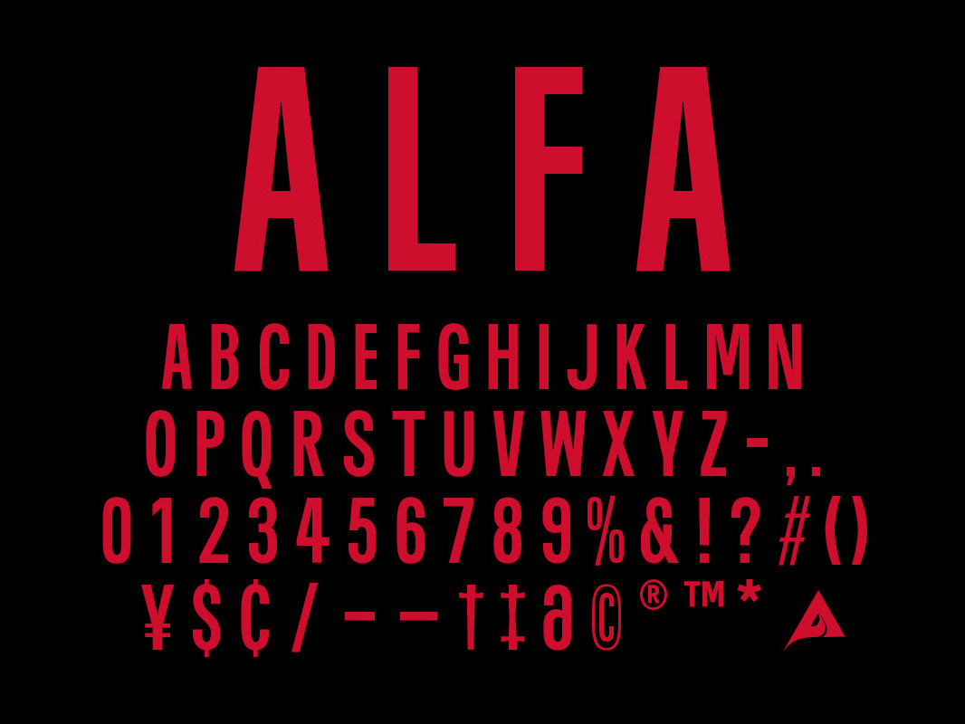
Right: References of the type found in New York City Subway Stations.

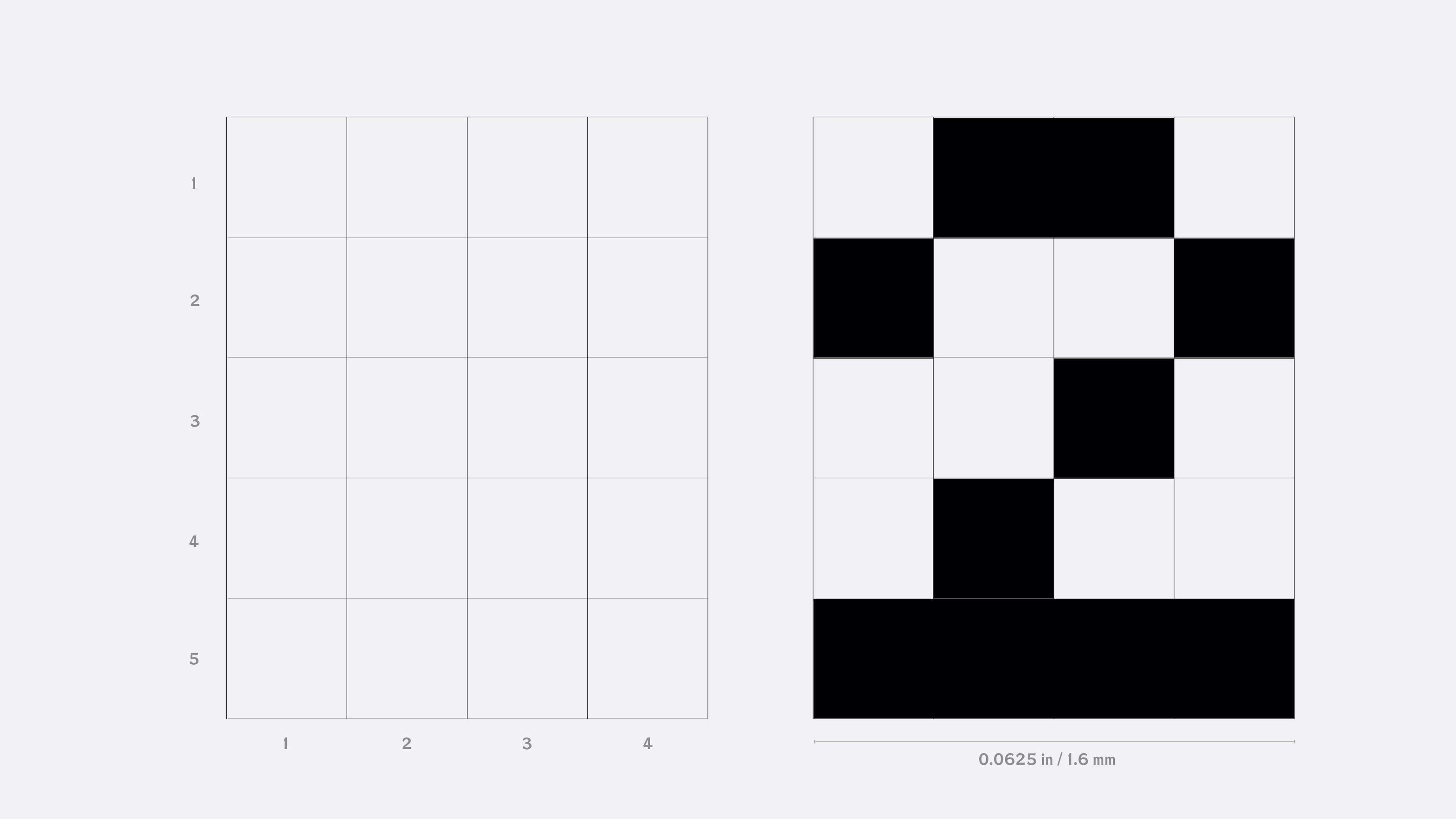
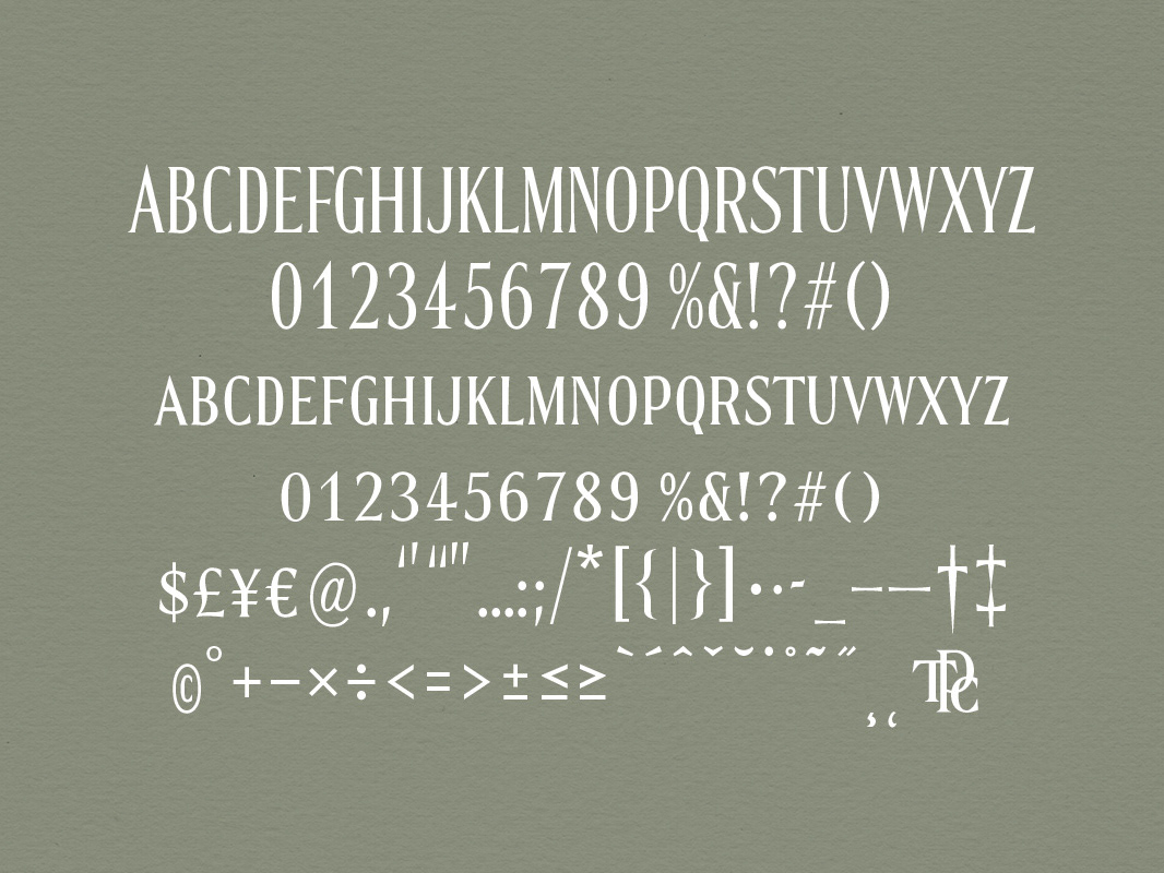
Over 40 characters need to fit into a limited amount of the space about 2 inch width a embodied with thread.  I began explore how small I cam make without losing the legibility, that I created 4x5 pixel grid and drawing over the grid.

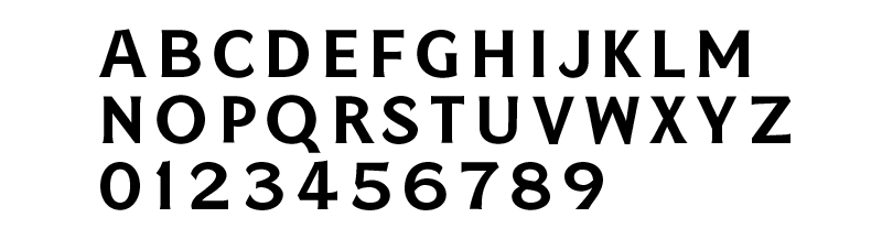
Drawn and design the type over the pixel font to add personality to work as normal font.

You may also like

Saggio
Created a display typeface for the US edition of Architectural Digest magazine, published by Condé Nast.
CUSTOM FONT • DEVELOPMENT
The Pollard Company
Joseph Pollard is a mens fashion designer, creative director. Collaborated with him to create a classic, timeless and chic bespoke typeface for his business.
BRANDING / CUSTOM FONT / STATIONARY
Wintour
Wintour is a text face family that indednded to use in the fashion magazine, Vogue.
FONT DEVELOPMENT
Pan Sans
Pan Sans is a revival type inspired and referenced based on the hard cover magazine PAN Annuaire du Luxe a Paris. An. 1928.
CUSTOM FONT / EDITORIAL DESIGN
Blumenfeld
Blumenfeld is a revival font based on the display font used in Vogue magazine in 1949 to 1951.
FONT DEVELOPMENT
Alfa Records
Alfa Records, founded in 1969, is known for its City Pop contributions and early YMO albums. Its catalog is now digitally archived, I am refining its original iconic Eiko Ishioka-designed logo and creating a full font from the logotype.
BRANDING / CUSTOM FONT/ LOGO / DIGITAL
France
Revival typeface based on a book “IN ALL FRANCE” by Antole France
FONT DEVELOPMENT
Eye Candy
Bespoke typography design for Podium Studio magazine #2, Obsession issue.
TYPOGRAPHY
Daisy Chain
Designed two modern, high-contrast display fonts. These are mono-spaced with square proportions, available in horizontal and vertical stressed versions.
CUSTOM FONTS / LOGO / EDITORIAL DESIGN
Victoria Display
A custom typeface design for Victoria's Secret, using throughout the brand's communication in print, in-store and digital uses.  
BRANDING / CUSTOM FONT / TYPE TEMPLATE
Back to Top